Telemetry Metrics
Metrics allow operators to understand the internal state of a system by observing its outputs.
In TriggerMesh, telemetry is achieved by exposing a variety of time-based numeric measurements — also referred to as time-series — that can be collected and analyzed by third-party monitoring solutions.
This guide provides an overview of the nature and format of the telemetry metrics exposed by the TriggerMesh platform, as well as detailed examples of approaches for collecting and analyzing them.
Exposed Telemetry Data
Metrics Categories
Here is an overview of the types of metrics that are exposed by TriggerMesh components. The list is deliberately broad and generic, as some categories of metrics may only be exposed by certain types of components.
- Processing of events
- Successes and errors
- Latency distribution
- Delivery of events
- Successes and errors
- Latency distribution
- Software runtime
- Heap memory usage
- Garbage collection
Later in this document, we will explore how metrics in these different categories can be collected, analyzed and visualized.
Data Model
Metrics are exposed by TriggerMesh in a line-oriented text-based format popularized by the Prometheus open source monitoring toolkit.
A Prometheus metric is typically represented as a single line of UTF-8 characters, optionally prepended with a HELP
and a TYPE comment lines, starting with the name of the metric and ending with its value:
# HELP event_processing_success_count The number of events successfully processed
# TYPE event_processing_success_count counter
event_processing_success_count{event_source="my.cloud.storage", event_type="object.created"} 129389
The HELP comment provides a description of what the metric represents, whereas the TYPE comment carries
information about the type of the metric (one of the four core metric types offered by
Prometheus).
As illustrated in the example above, the metric name may be directly followed by a list of comma-separated key-value pairs between curly brackets called labels. Labels allow differentiating the characteristics of what is being measured. Each unique combination of labels identifies a particular dimension of a metric. Labels, and metric dimensions by extension, vary from metric to metric.
Enabling Metrics
By default TriggerMesh does not enable any metrics backend. Observability of TriggerMesh can be configured
via the config-observability ConfigMap object.
For example, the following ConfigMap object enables the Prometheus metrics exporter in all TriggerMesh components:
apiVersion: v1
kind: ConfigMap
metadata:
  name: config-observability
  namespace: triggermesh
data:
  metrics.backend-destination: prometheus
For a description of the configuration settings which are currently supported, please refer to the
observability.yaml manifest files inside the Knative Eventing source repository.
Access to Metrics
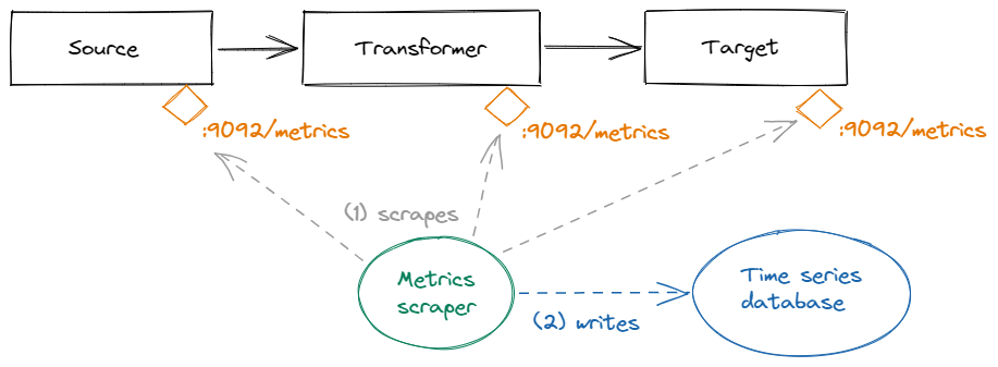
Every TriggerMesh component exposes a set of telemetry metrics on the local HTTP endpoint :9092/metrics. Available
measurements can be retrieved via a simple GET request. The returned values are an instant view of each
measurement at the time of the request.
This model is particularly suitable for a pull-based retrieval of metrics ("scrape") on a fixed interval by monitoring software, and for storage in a time-series database. Prometheus itself is a popular choice for this job, as it includes both a server for scraping telemetry metrics, and a time-series database optimized for the Prometheus data model.
Most of the available metrics fall into the categories described previously in this document, whenever applicable based on the type of component. Some components may expose additional, application-specific metrics. The data model presented in the previous section makes these metrics easily discoverable by consumers.
Collection and Analysis with Prometheus and Grafana
This section provides examples of configurations for collecting metrics from TriggerMesh components using the Prometheus monitoring toolkit, and visualizing them using the observability platform Grafana.
The rest of this document assumes that Prometheus and Grafana are both available in the Kubernetes cluster where TriggerMesh is deployed.
Tip
If you don't already have Prometheus and Grafana set up in your TriggerMesh cluster, we recommend installing a pre-configured Prometheus-Grafana stack using the Helm application manager for Kubernetes by executing the commands below:
helm repo add prometheus-community https://prometheus-community.github.io/helm-charts
helm repo update
helm install -n monitoring prometheus-stack prometheus-community/kube-prometheus-stack
Detailed installation instructions are available in the kube-prometheus-stack chart's
documentation.
Scraping Metrics via Prometheus
The Prometheus Operator — which is included in the aforementioned kube-prometheus Stack and manages most Prometheus installations on Kubernetes — allows configuring Prometheus' scrape targets using familiar Kubernetes API objects.
The manifest below contains a PodMonitor that instructs Prometheus to automatically discover and scrape TriggerMesh components:
apiVersion: monitoring.coreos.com/v1
kind: PodMonitor
metadata:
  name: triggermesh-components
  namespace: monitoring
spec:
  selector:
    matchLabels:  # (1)
      app.kubernetes.io/part-of: triggermesh
  namespaceSelector:  # (2)
    any: true
  podMetricsEndpoints:  # (3)
  - port: metrics
  - port: user-port
    relabelings:
    - action: replace
      targetLabel: __address__
      sourceLabels:
      - __meta_kubernetes_pod_ip
      replacement: $1:9092
  jobLabel: app.kubernetes.io/name  # (4)
- Selects all targets (Pods) that are labeled as being managed by TriggerMesh.
- Looks up targets (Pods) matching the above selector in all Kubernetes namespace.
- For targets that matched the above selectors, either scrape the port named
metricsif it exists, or fall back to the TCP port9092. - Sets the value of the
joblabel in collected metrics to the name of the component.
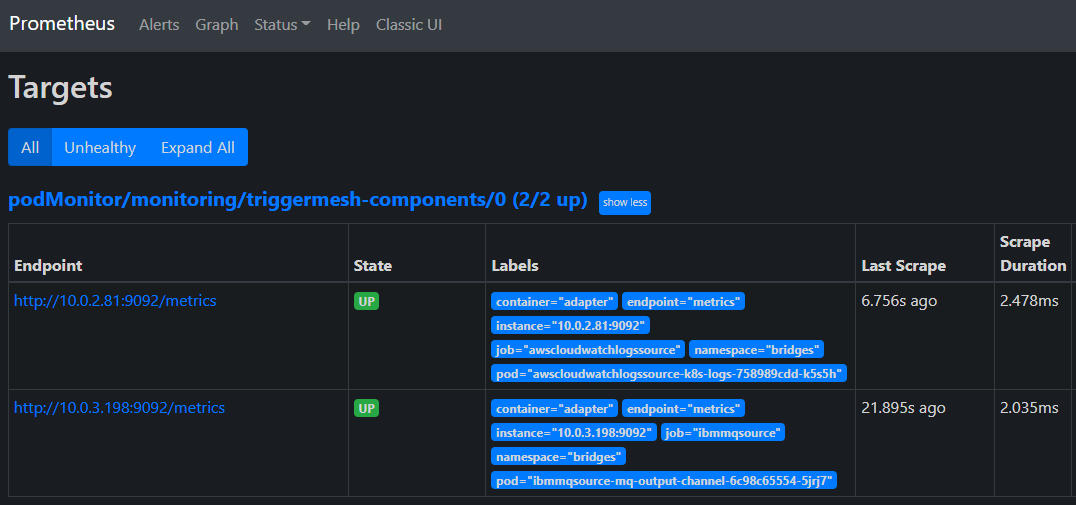
After applying this configuration to the Kubernetes cluster using the kubectl apply -f command, a list of targets
matching the name of the PodMonitor should be reported by Prometheus with the state UP.
Tip
If you installed Prometheus via the kube-prometheus-stack Helm chart — as suggested in the
introduction to this section — you should be able to forward the local port 9090 to the Prometheus instance
running in the Kubernetes cluster:
Then, open your web browser at http://localhost:9090/targets.
Visualizing Metrics in a Grafana Dashboard
By combining the visualization power of Grafana with the query language of Prometheus, we are able to analyze trends in collected metrics using different types of graphs and charts.
In the following example, we will create a dashboard like the one below where we analyze the latency distribution of a given measure — such as the processed or delivered events — over a selected period of time.
Tip
If you installed Grafana via the kube-prometheus-stack Helm chart — as suggested in the
introduction to this section — you should be able to forward the local port 3000 to the Grafana instance
running in the Kubernetes cluster:
Then, open your web browser at http://localhost:3000.
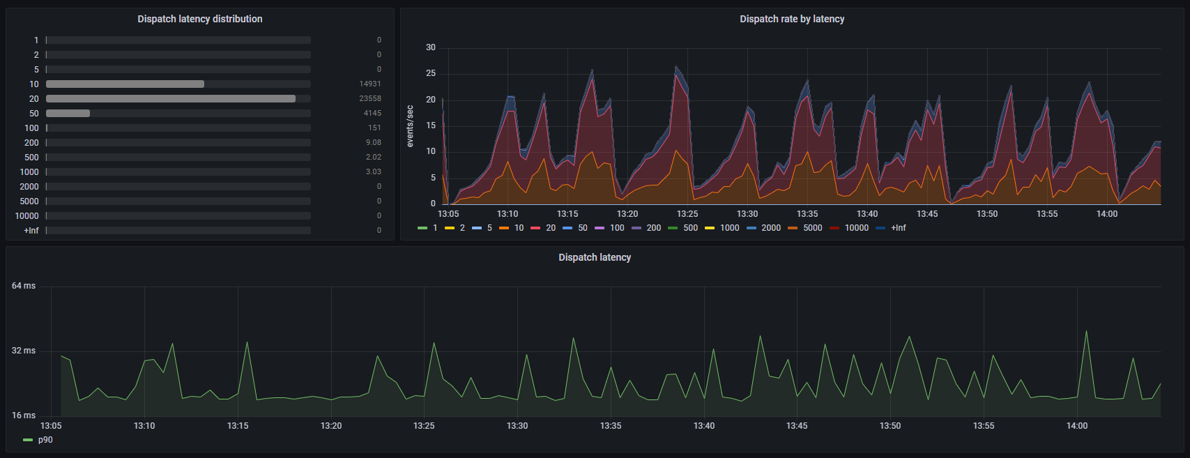
Number of Events Grouped by Latency Bucket
In this panel, we will use a bar gauge to display the distribution of the time spent by a component processing events over a selected period of time, organized in latency buckets.
The chart will be based on a Prometheus metric of type histogram with a pre-configured bucket distribution in milliseconds, defined by TriggerMesh as follows:
# HELP event_processing_latencies Time spent in the CloudEvents handler processing events
# TYPE event_processing_latencies histogram
In a histogram metric, cumulative counters for each bucket are exposed as sub-metrics of the main histogram metric, with
_bucket appended to the name, and a le ("less than or equal") label indicating the upper bound of the bucket, such
as in the example below:
event_processing_latencies_bucket{le="1"} 0
event_processing_latencies_bucket{le="2"} 0
event_processing_latencies_bucket{le="5"} 1541
event_processing_latencies_bucket{le="10"} 6161
event_processing_latencies_bucket{le="20"} 6776
event_processing_latencies_bucket{le="50"} 6865
event_processing_latencies_bucket{le="100"} 6868
We can start by charting the evolution of the raw counters corresponding to each latency bucket over time in a standard time series graph, before switching to bar gauges, in order to understand the metric's trend:
Warning
Always select the Heatmap format while working with Prometheus metrics of type histogram. This enables
Grafana's intrinsic knowledge about Prometheus histograms, which results in buckets being sorted per le value and
distinctive counts being shown for each bucket as one would expect.
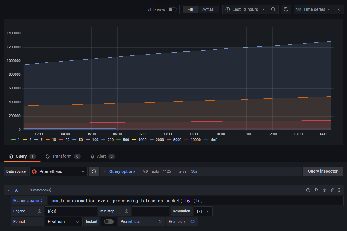
We can observe that counter values are cumulative. Some buckets have a steeper evolution than others, which already hints at a trend about the distribution of the component's processing latency.
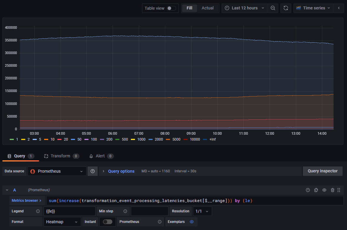
When switching from a time series chart to a bar gauge chart, we will want the summary value to correspond to the aggregation of all events processed in a given latency bucket. We could be tempted to simply summarize totals as the last value per bucket in the selected time period, but
- This would show the overall total of events processed by the component prior to the end of the time period, not the total of events processed during the selected time period.
- This might result in skewed calculations if the counters were reset during that time period, as illustrated at the very end of the range in the previous graph. Such situation isn't unusual and could occur for different reasons, such as roll outs of new versions, horizontal scaling, Pod relocations, etc.
We will instead calculate the increase in the time series in the selected time range using a query function which adjusts for breaks in monotonicity, such as counter resets:
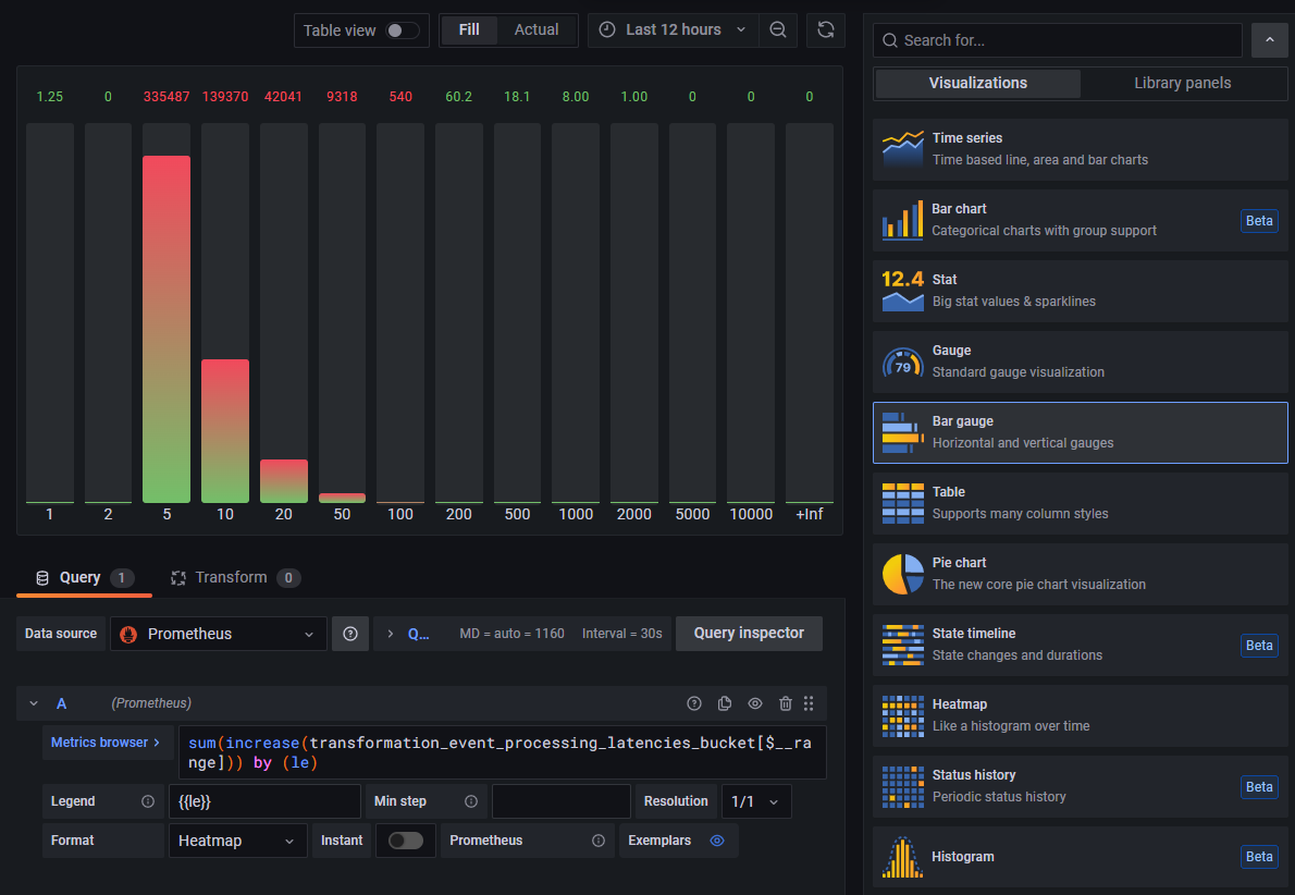
Selecting Bar Gauge in the list of visualizations instead of Time Series now shows a histogram which summary values
accurately represent the number of events processed in each latency bucket for the selected time period:
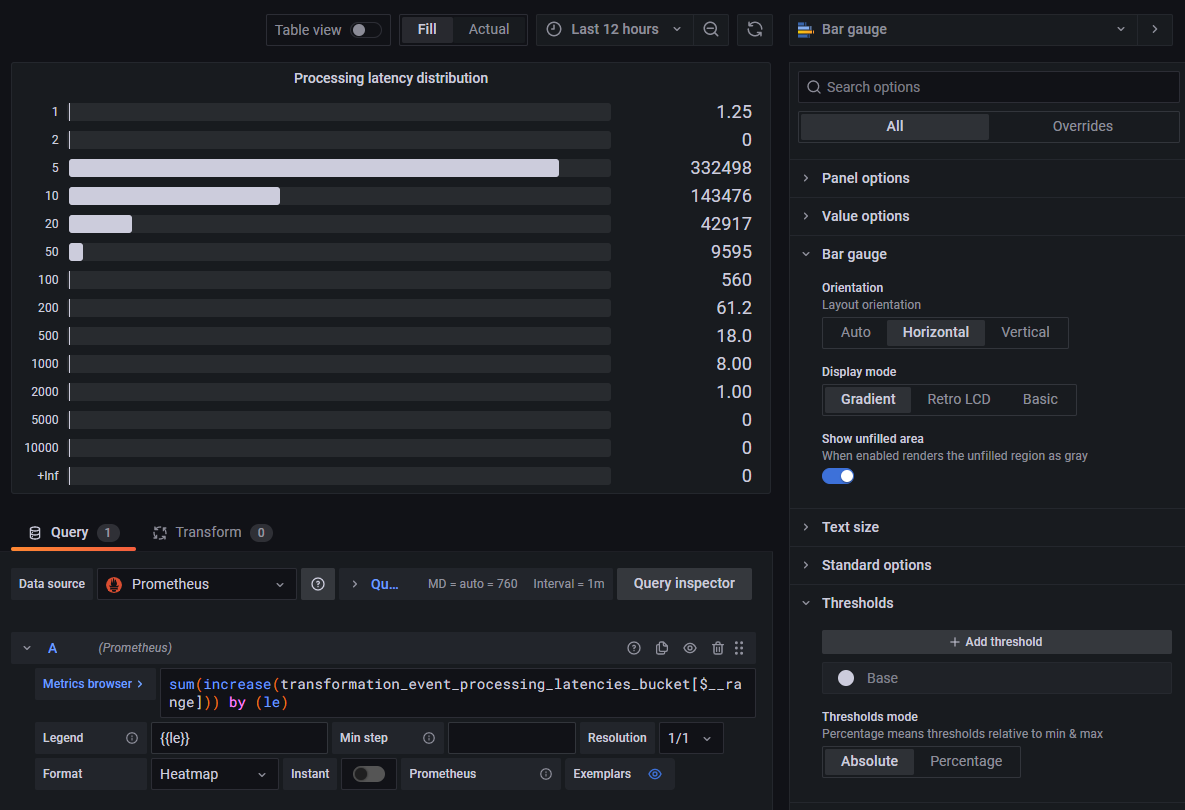
The visualization options can be adjusted to one's preferences in order to obtain the desired result:
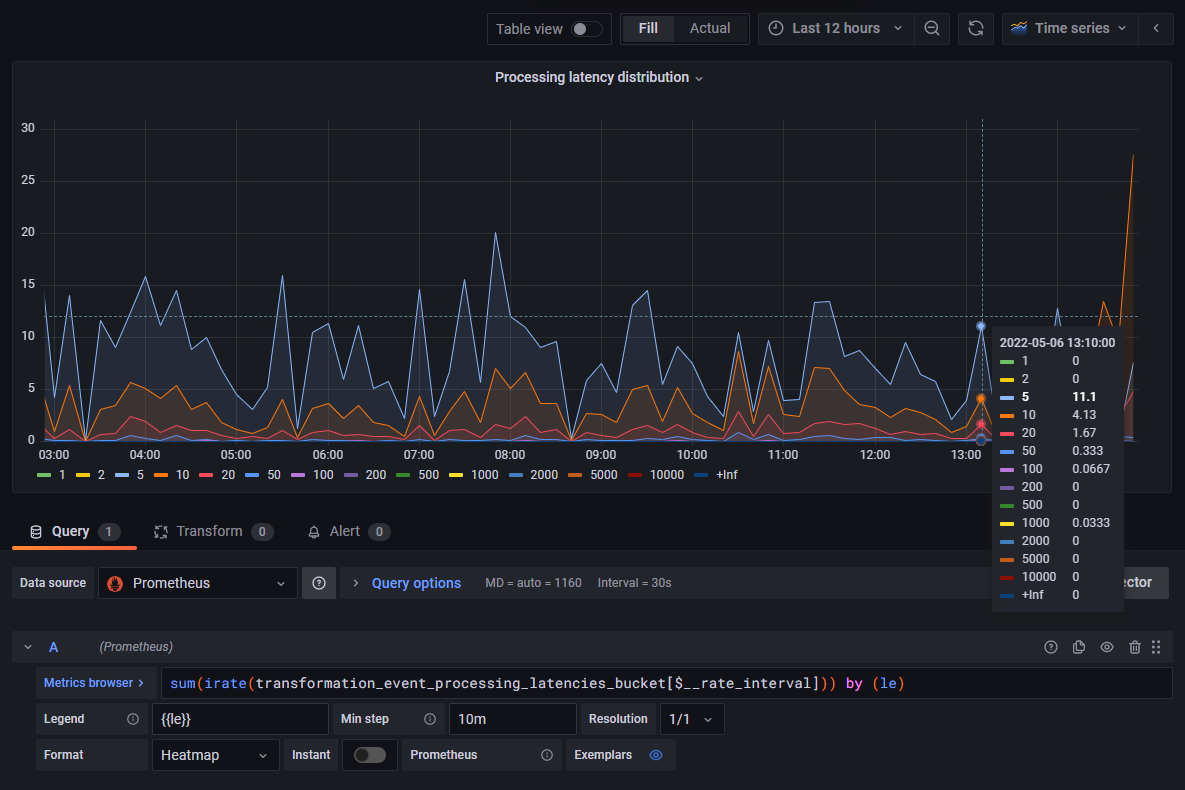
Rate of Processed Events by Latency Bucket
In this panel, we will use a time series graph to display the rate of events processed by a component over time, and distributed in latency buckets.
The chart will be based on the same Prometheus metric as in the previous example.
This time around, we will stick with the default Time Series visualization, but replace the increase() function used
previously with the irate() function:
The interval used to calculate the rate of change of the metric can be either
- Selected manually using an explicit time duration such as "[3m]".
- Delegated to Grafana using Grafana's
$__rate_intervalvariable, which calculates an optimal value based on the number of data points in the graph.
The result of this calculation is a series of metrics ("instant vectors"), each representing the number of events per second processed by the component over time in a given latency bucket:
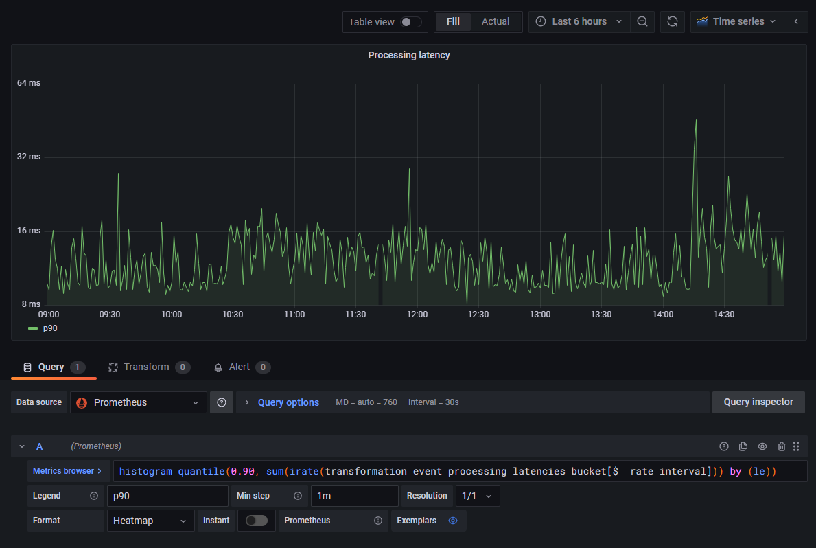
90th Percentile of the Processing Latency Over Time
In this panel, we will use a time series graph to display the 90th percentile of processing durations of events handled by a component over time. This measure indicates the longest time it took to process an event, for 90% of all the events processed during each time interval on the graph.
The chart will be based on the same Prometheus metric as in the previous example.
We can reuse the query from the previous example, and pass it to the histogram_quantile() function with the desired
quantile:
histogram_quantile(0.90,
  sum(
    irate(event_processing_latencies_bucket[$__rate_interval])
  )
) by (le)
The result of this calculation is a single metric ("instant vector"). An interesting exercise could be to compare this graph with the rate of processed events measured in the previous example, and observe whether or not spikes in the 90th latency percentile can be correlated with higher processing rates:
Additional Notes and Takeaways
It can be noted that, in the previous examples, we generated three valuable types of visualizations from a single metric, by simply changing Prometheus queries to perform different types of calculations/aggregations.
Thanks to the power of time series and the multi-dimensional aspect of Prometheus metrics, we could explore other types of visualizations based on this same metric, for example by filtering or grouping metrics by labels.
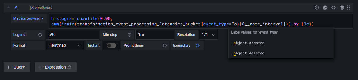
For instance, the following query could be used to graph the event processing rate over time broken down by event type:
This other query could be used to graph the event processing rate over time for a specific event type:
The same idea can be applied when it comes to visualizing metrics pertaining to a specific instance of a given component, or for example to all instances of that component within a specific Kubernetes namespace. There is a large amount of possibilities to be explored, the only limit is the choice of labels available for each metric.